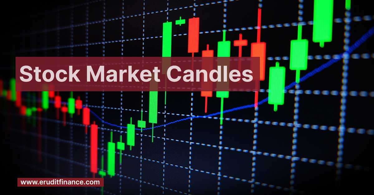
Japanese candlestick charts are a crucial tool in stock market analysis, offering a visual representation of price movements over specific time frames. Each candlestick denotes open, high, low, and close prices, with the body representing the open and close and wicks indicating highs and lows. Colors, typically green for upward movement and red for downward, convey the relationship between opening and closing prices. Traders leverage candlestick patterns like doji or engulfing to predict market trends and make informed decisions. This intuitive method of charting provides a snapshot of market sentiment and aids investors in navigating price fluctuations effectively.
Stock Market Candles
Japanese Candlestick charts, a vital component of stock market analysis, offer a comprehensive view of price movements using distinct visual elements.
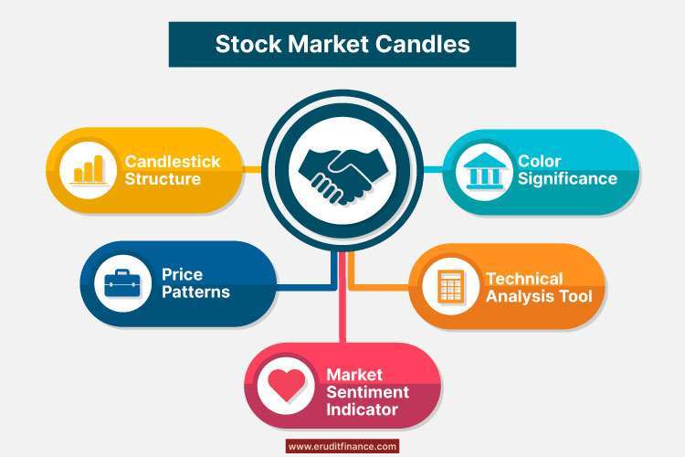
1). Candlestick Structure- Each candlestick represents a specific time frame (e.g., day, week) and comprises four key components: open, high, low, and close. The rectangular “body” of the candle denotes the opening and closing prices, while the lines or “wicks” extend from each end, illustrating the highest and lowest prices during the timeframe.
2). Color Significance- Candle colors convey the relationship between opening and closing prices. Green or white candles suggest upward movement, indicating a close higher than the open, while red or black candles signify downward movement.
3). Price Patterns- Traders analyze various candlestick patterns to predict market trends and potential reversals. Examples include the Doji, Hammer, Shooting Star, and Engulfing patterns. These patterns provide insights into market sentiment, aiding traders in anticipating potential shifts in supply and demand dynamics.
4). Technical Analysis Tool- Candlestick charts serve as a powerful technical analysis tool, offering a visual representation of historical price movements. Patterns and trends identified in candlestick charts help traders make informed decisions, enhancing their ability to time entries and exit effectively.
5). Market Sentiment Indicator- The visual nature of candlestick charts makes them an excellent indicator of market sentiment. Patterns and color trends provide quick insights into whether buyers or sellers dominate the market.
Understanding and interpreting candlestick charts empower traders with valuable insights into market dynamics, facilitating strategic decision-making and risk management in the stock market.
How Many Candles Are in the Stock Market?
the term “candles” usually refers to individual candlesticks on a price chart rather than a physical object. Each candlestick represents a specific period, such as a day, week, or hour, depending on the chosen chart timeframe. The number of candles on a stock market chart is determined by the duration or timeframe selected by the trader or analyst. For example:
- A daily chart will have one candlestick for each trading day.
- A weekly chart will display one candlestick for each trading week.
- An hourly chart will show one candlestick for each hour of trading.
The total number of candles on a chart reflects the historical price action within the chosen timeframe. Traders use these candles to analyze patterns, trends, and potential market reversals, helping them make informed decisions about buying or selling assets. The number of candles can vary widely based on the duration of the chart and the historical timeframe being considered.
What Is the Best Candle in the Stock Market?
In the context of candlestick charts in the stock market, there isn’t a single “best” candle as each candle provides specific information about price action. Traders and analysts often look for patterns formed by sequences of candles rather than individual candles. Here are a few key candlestick patterns that traders commonly analyze.
| Doji- This signifies indecision in the market, where the opening and closing prices are very close or identical. |
| Hammer and Hanging Man- Hammer indicates potential reversal after a downtrend, with a small body and long lower wick. Hanging Man is similar but appears after an uptrend, suggesting a potential reversal. |
| Engulfing Patterns- Bullish Engulfing- Occurs in a downtrend, where a larger bullish candle engulfs the previous bearish candle. Bearish Engulfing- Occurs in an uptrend, where a larger bearish candle engulfs the previous bullish candle |
| Morning Star and Evening Star- Morning Star signals a potential bullish reversal, consisting of a bearish candle, followed by a small-bodied candle, and then a bullish candle. Evening Star indicates a potential bearish reversal, with a bullish candle, followed by a small-bodied candle, and then a bearish candle. |
| Shooting Star and Inverted Hammer- Shooting Star appears in an uptrend and suggests a potential reversal with a small body and long upper wick. Inverted Hammer appears in a downtrend, signaling a potential reversal with a small body and long upper wick. |
Is Candlestick Good for Trading?
Yes, candlestick charts are widely regarded as a valuable tool for trading in financial markets. Here are some reasons why candlestick charts are considered beneficial for traders.
- Visual Representation- Candlestick charts provide a clear and visual representation of price movements, making it easier for traders to interpret and analyze market trends.
- Price Patterns- Candlestick charts help traders identify various price patterns, such as reversal patterns, continuation patterns, and consolidation patterns. Recognizing these patterns can assist in predicting potential future price movements.
- Market Sentiment- The color-coded nature of candlesticks (green/white for bullish and red/black for bearish) helps traders quickly assess market sentiment. This information is crucial for understanding the balance between buyers and sellers in the market.
- Historical Analysis- Candlestick charts allow traders to review historical price action, enabling them to identify key support and resistance levels, trend changes, and other critical market dynamics.
- Combination with Technical Indicators- Traders often combine candlestick analysis with other technical indicators to enhance their trading strategies. This holistic approach provides a more comprehensive view of the market.
- Entry and Exit Signals- Candlestick patterns can serve as signals for entry and exit points. For example, specific patterns may indicate a potential reversal, helping traders make decisions about when to enter or exit a trade.
- Intraday and Long-Term Analysis- Candlestick charts are versatile and can be applied to various timeframes, from intraday trading to long-term investing. This flexibility makes them suitable for different trading styles and preferences.
Why Do Traders Use Candles?
Traders use candlestick charts for several reasons due to the benefits and insights they offer in analyzing price movements in financial markets.
1). Visual Clarity- Candlestick charts provide a clear and visually intuitive representation of price action. Traders can quickly interpret the relationship between opening, closing, high, and low prices for a given period.
2). Pattern Recognition- Candlestick charts help traders identify and interpret various patterns, such as reversal patterns, continuation patterns, and candlestick formations. Recognizing these patterns can provide insights into potential future price movements.
3). Market Sentiment- The color-coded nature of candlesticks (green/white for bullish and red/black for bearish) allows traders to gauge market sentiment easily. This information helps in understanding the prevailing mood among buyers and sellers.
4). Historical Analysis- Candlestick charts enable traders to review historical price data efficiently. Analyzing past patterns and trends helps identify key support and resistance levels, facilitating more informed decision-making.
5). Entry and Exit Signals- Traders use candlestick patterns as signals for potential entry or exit points in a trade. Specific candle formations can indicate trend reversals, trend continuations, or potential breakouts.
6). Trend Identification- Candlestick charts assist in identifying the direction and strength of trends. Trends are crucial for traders as they help in making decisions on whether to go long (buy) in an uptrend or short (sell) in a downtrend.
7). Combination with Technical Indicators- Traders often combine candlestick analysis with other technical indicators, such as moving averages or oscillators, to confirm or validate their trading decisions.
8). Versatility- Candlestick charts can be applied to various timeframes, making them suitable for different trading styles, from short-term intraday trading to long-term investing.
9). Psychological Aspects- Candlestick patterns often reflect market psychology and the emotional state of market participants. Traders use this insight to anticipate potential market reversals or continuations.
Which Time Frame Is Best for Trading?
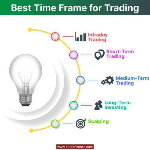
The choice of the best time frame for trading depends on individual trading preferences, strategies, and goals.
Different time frames offer unique advantages and drawbacks, catering to various trading styles.
Here’s an overview of common time frames and their suitability for different traders.
| Time Frames | Suitability | |
| Intraday Trading | 1-minute, 5-minute, 15-minute charts. | Well-suited for day traders who open and close positions within the same trading day. Short-term price movements are the focus, and technical analysis is crucial. |
| Short-Term Trading | 30-minute, 1-hour charts | Short-term traders aim to capture trends over a few days. Appropriate for swing traders and those looking for more flexibility than intraday trading. |
| Medium-Term Trading | 4-hour, daily charts | Ideal for swing traders and position traders who aim to capture trends that unfold over several days to weeks. Allows for a more relaxed trading approach. |
| Long-Term Investing | Weekly, and monthly charts | Best for investors with a long-term perspective. Weekly and monthly charts provide a broader view of market trends, helping investors make informed decisions over longer holding periods. |
| Scalping | Tick charts, 1-minute charts | Scalpers focus on very short-term price movements, entering and exiting positions quickly. Tick charts or 1-minute charts provide the necessary granularity for rapid decision-making. |
Ultimately, the best time frame for trading depends on factors such as risk tolerance, time commitment, and personal preferences. Traders often use a combination of time frames for different aspects of their analysis. It’s crucial to align the chosen time frame with the trading strategy and to consider the level of market activity during those periods. Additionally, adapting to changing market conditions and being flexible with time frames can contribute to a more versatile trading approach.
What Is the Gap Between Candles in Trading?
In trading, the “gap between candles” refers to the space or distance between the closing price of one candlestick and the opening price of the next candlestick on a price chart. This gap can occur for various reasons and has implications for technical analysis. Here are two common types of gaps.
Price Gap
- A price gap occurs when the opening price of a candlestick is significantly different from the closing price of the previous candlestick.
- An “upward price gap” happens when the opening price of the new candle is higher than the previous candle’s closing price.
- A “downward price gap” occurs when the opening price is lower than the previous candle’s closing price.
- Price gaps often signify significant shifts in market sentiment and can be associated with events such as earnings reports, news releases, or other market-moving information.
Chart Gap (Time Gap)
- A chart gap, also known as a time gap, occurs when there is no trading activity during a specific period, leading to a visible gap on the chart.
- For example, in intraday trading, if the market is closed for a certain period, there will be a gap on the chart where no price data is available.
- Chart gaps can also occur on longer timeframes, such as weekends or holidays when the market is closed.
Traders often analyze these gaps to gain insights into market dynamics and potential future price movements.
Who Invented Candlestick?
The use of candlestick charts in financial markets traces back to Japan in the 18th century. While the exact individual credited with inventing candlestick charts is not known, they are often attributed to a Japanese rice trader named Munehisa Homma.
Bottomline:-
Candlestick charts, pioneered by Japanese rice trader Munehisa Homma in the 18th century, offer a visually intuitive representation of price movements in the stock market. Comprising candle bodies and wicks, each candlestick reveals open, high, low, and close prices, aiding traders in pattern recognition and trend analysis. An invaluable tool, candlestick charts empower traders to make informed decisions based on historical data and market sentiment, contributing to effective risk management and strategy formulation.
Also Read:-